
Colors play an important role in creating a harmonious and welcoming environment in the bedroom. They can affect your mood, energy levels and even the quality of your sleep. Choosing the right colors can create a space that helps you relax and rest better.
Warm and calm colors
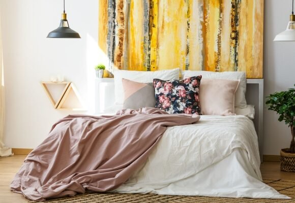
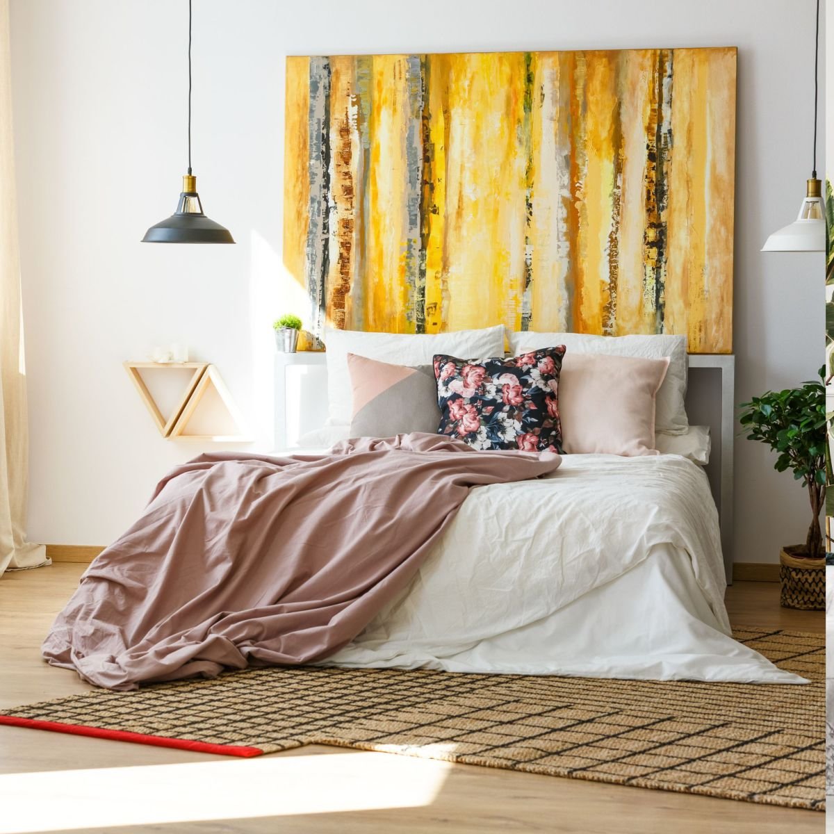
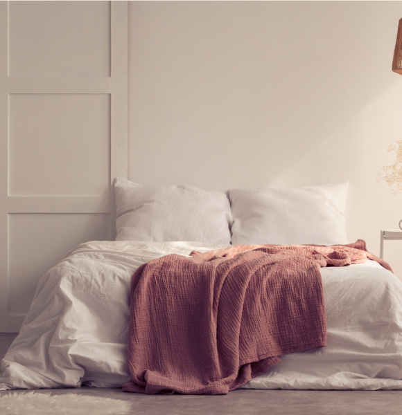
Warm, calm colors such as beige, light brown, peach or terracotta are a great choice for creating an atmosphere of coziness and tranquility in your home. These tones are particularly suitable for wall painting, fabrics such as curtains, bedspreads or cushions, as well as decorative details such as vases or paintings. They not only help you relax, but also create a harmonious environment, ideal for rest and good sleep.
Blue and green shades
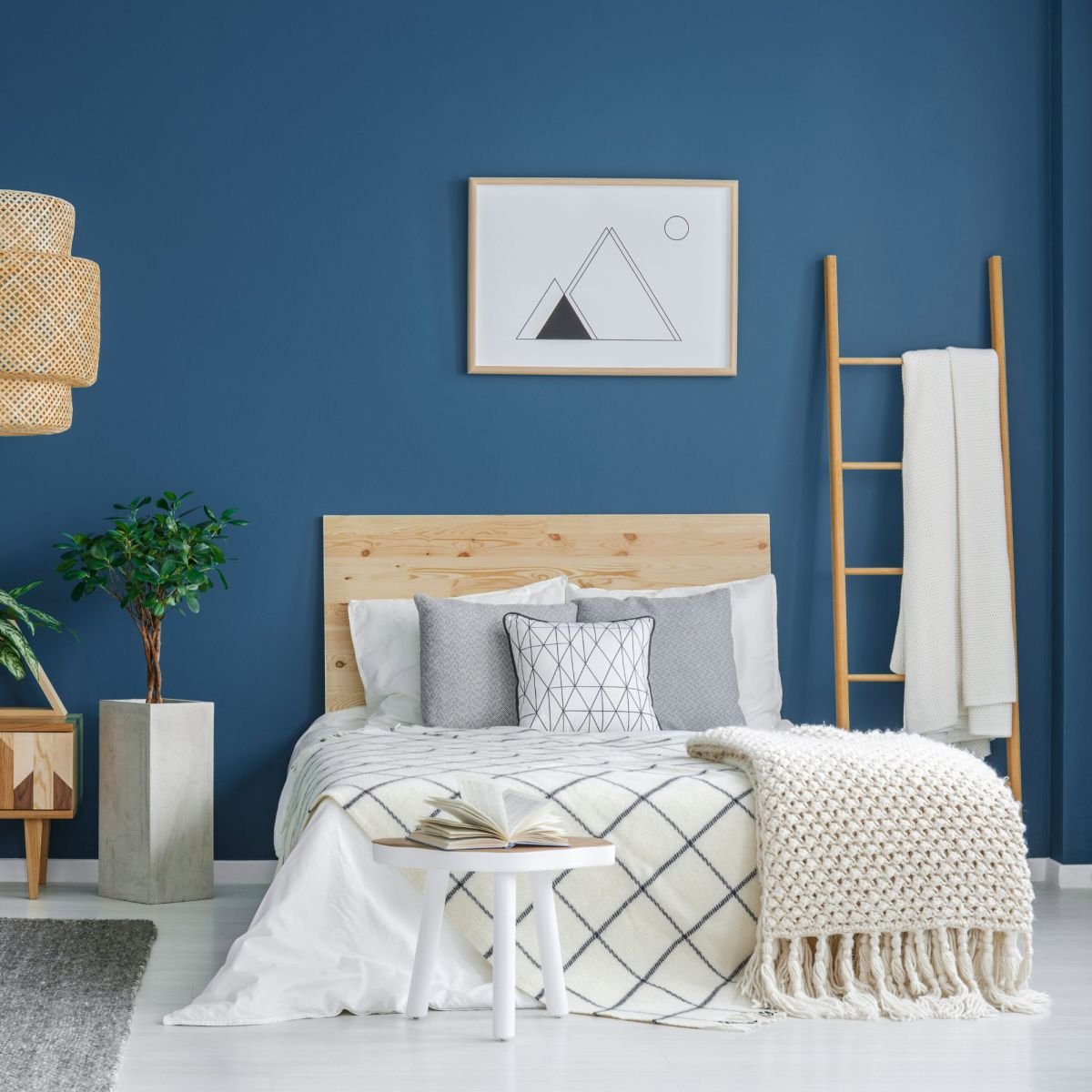
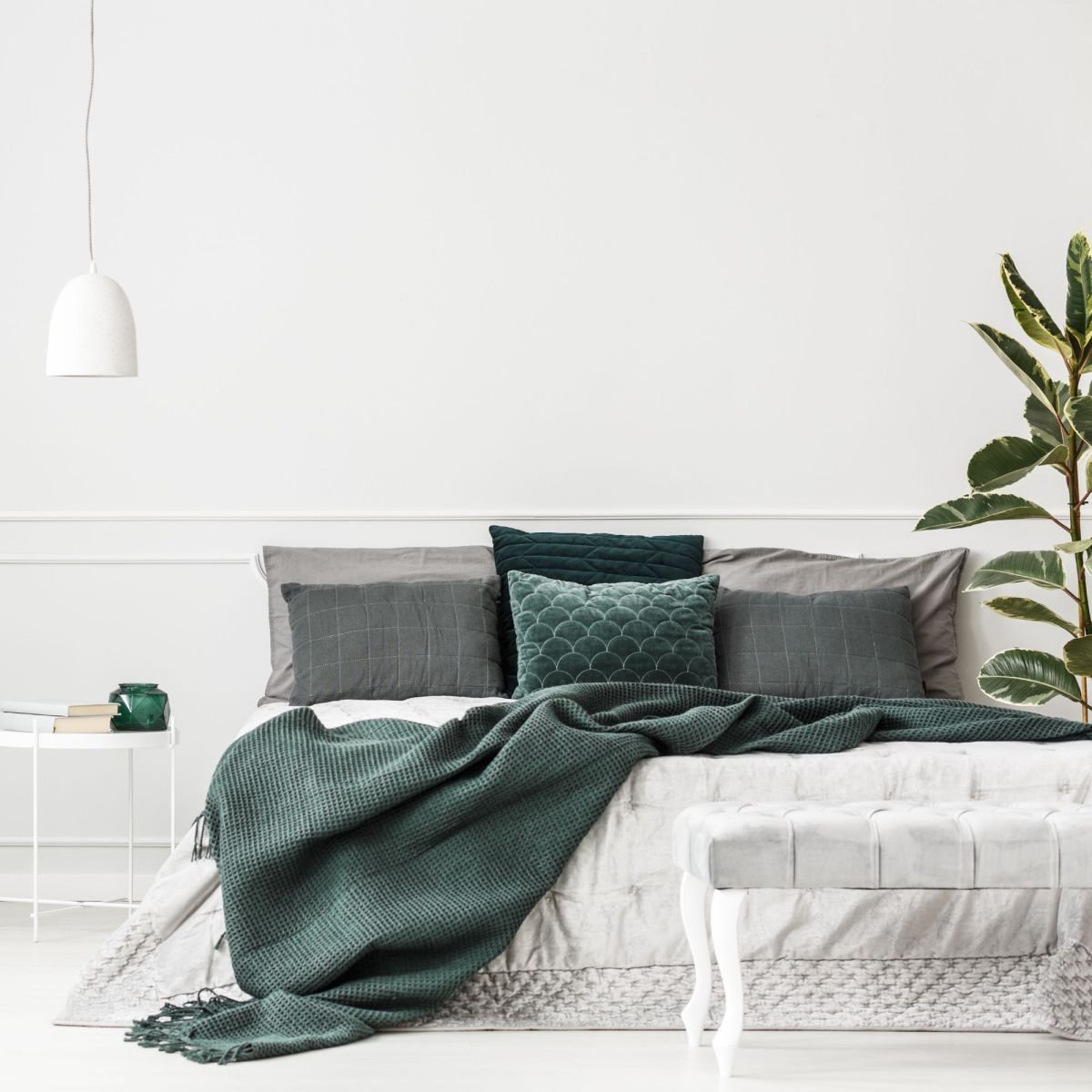
Blue and green colors, especially their soft, pastel shades, have a strong calming effect that helps you relax and reduce stress. These colors are associated with nature: blue recalls the tranquility of the sky and water and green recalls the vitality and harmony of vegetation. These characteristics make them the ideal choice for creating a welcoming and peaceful atmosphere.
Bedding in shades of blue or green not only looks great, but also helps you feel calm. For example, pastel-colored cushion covers or bedspreads can be combined with warmer color accents to make the interior look harmonious.
If you want a little dynamism, choose fabrics with subtle patterns, such as motifs of leaves, flowers or waves in shades of blue and green. This will add vitality to the room while maintaining an overall atmosphere of calm.
Blue and green colors allow you to create a naturally harmonious interior that relaxes and pleases the eye. They pair well with other warm or neutral colors, so they easily fit into various interior styles.
Neutral colors
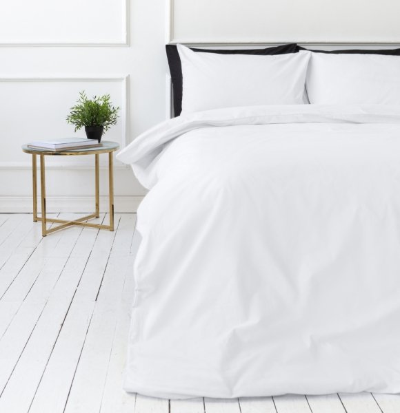
Neutral colors like gray, white, cream or beige are one of the most versatile interior design palettes. They give a sense of subtle elegance and tranquility, making them an excellent choice for a bedroom where it is important to create an atmosphere of relaxation and rest. Neutral tones combine easily with each other and with other colors, offering many possibilities for various interior styles.
White or soft cream bedding is a classic choice that gives a sense of cleanliness and order. Adding subtle gray accents, such as patterned or fringed pillowcases, can create a minimalist yet luxurious feel.
Neutral colors make it easy to integrate brighter or unexpected accents. For example, colorful vases, artwork, or brighter furniture like a chair or table create a great contrast and draw attention while maintaining the overall calm of the room.
Lighting: Neutral colors reflect light very well, so warm and soft lighting emphasizes the feeling of coziness even more. Choose lamps that diffuse light that do not dazzle and complete the harmony of the space.
Neutral colors are a great choice not only for their versatility, but also for the ability to easily update interiors simply by changing accents or fabrics. They create a long-lasting base that never goes out of style, so this color palette is suitable for both minimalist and classic style interiors.
Bright colors
Bright colors like red, orange or yellow give a sense of energy and vitality. They are often used as a source of stimulation, but due to their intensity these colors are not always suitable for calm spaces such as the bedroom. However, when used correctly, bright colors can become interesting accents that give the interior playfulness and uniqueness without overloading the space.
Decorative cushions: Bright red, orange, or yellow pillows can make a great accent in a neutral-colored bed. Combine them with softer tones to maintain balance and not overwhelm the room.
Decorative bedspreads and blankets: A red or orange throw, especially one with a subtle pattern, can make a bold accent. If the entire bed is neutral, this color adds vibrancy and modernity.
Vases and decorative details: Small, bright elements like vases, candles, or figurines add interest to the room without oversaturating the space.
Lighting elements: Vibrant colors can be incorporated through lighting details, such as a bright yellow table lamp or light sources with colorful shades.
Balance and harmony: The most important thing is not to overdo it. Bright colors should be used sparingly, only in certain areas of the interior, so that they complement the overall design and do not dominate. They are best paired with neutral or muted tones such as grey, white or beige, which provide a backdrop that lets the bright colors shine through.
Bright colors can be a playful, joyful and energetic addition to a bedroom space when used responsibly and thoughtfully.
How to choose the right bed linen?
Bedding is one of the most important elements of the bedroom, which has a direct impact on the quality of sleep. When choosing bed linen, pay attention not only to materials, but also to colors:
-
- Blue shade: Helps relax and reduce stress.
-
- Green: promotes harmony and gives a sense of nature.
-
- Neutral colors: Create a sense of cleanliness and order.
-
- Pastel tones: ideal for a welcoming and relaxing atmosphere.
Summary
Colors are a powerful tool that can help create the right mood and improve the quality of sleep. By carefully choosing the color palette for your bedroom and combining it with the right bedding, you can create a space where you will want to spend every moment of rest.
Looking for stylish, high-quality bedding sets or other bedroom products? Visit the Savashome page where you will find a wide selection of bedding, blankets, blankets, bedspreads, cushions and other textile products. Find out what will help you create a welcoming and harmonious atmosphere in your home!
Latest posts
How to wash, dry and care for bedding?
Curtains are an exclusive highlight of home interiors

Restless children’s sleep

Satin care: tips and guidelines
Why are satin bedding sets so popular?

Home textiles for sensitive skin
How to choose a dress model?
Baby blankets: why are they important and how to choose them?

Herbs: Natural Ways to Improve Sleep